Building My First Developer Portfolio: Research, Design, and Code
Hello, I am an 18-year-old young developer from Argentina. I officially started studying software programming on 05/01/2024 with the ambition of becoming a competent professional in the field of technology. Like many junior developers, I face the challenge of how to effectively present my projects and stand out in the job market. In this blog, I want to share my experience and learnings when creating my portfolio, a crucial tool for any aspiring programmer.
First of all, I want to say that at the beginning of this year I was researching several things before diving into the world of software. It always caught my attention, but I didn’t have a computer to write code, so I didn’t have any illusions about learning languages or tools. In fact, I didn’t even know where to start writing code.
However, last year they gave out some government computers that opened the doors to an opportunity in this world for me, and I plan to take advantage of them to dive fully into something that I loved from the beginning. With the little time and all the possibilities it offers, I see programming as something truly beautiful.
I decided to create a portfolio because I was facing two major challenges: I didn’t know how to showcase my projects effectively and I wasn’t clear on how to “sell” myself to potential employers. In several videos from the programming community on YouTube, I repeatedly heard that for someone with my characteristics, the best option was to create a portfolio to grab attention and stand out. So I set out to do it, hoping to improve my online presence and increase my job opportunities.
Now, let me tell you how I created my first portfolio…
The Beginning of My Journey: Research and Learning
My journey to create a portfolio began long before writing a single line of code. Aware of the importance of this project, I decided to dive into extensive research. My first stop was YouTube, where I devoted myself to watching a wide variety of videos about portfolios, including tutorials, design tips, and numerous critiques of portfolios from various content creators.
During this research phase, MiduDev’s videos became a particularly valuable resource. His detailed portfolio reviews, along with the advice from design professionals he often invited, provided me with a deep and practical perspective. Through his content, I was not only able to observe current trends in portfolio design, but also to identify common mistakes to avoid. MiduDev’s contribution to the programming community is truly remarkable, especially for those of us, like me, who are taking our first steps in this field.
Through these videos, I was absorbing crucial information:
-
What elements are fashionable in current portfolios
-
Common mistakes made by junior developers
-
Professional advice on design and structure
-
Elements that recruiters and employers look for in a portfolio
From Concept to Sketch
Once I felt that I had a solid understanding of what constitutes a good portfolio, I decided to move on to the design phase. For this, I turned to tldraw, a drawing tool similar to Paint, but with features that make it ideal for sketching web design ideas.
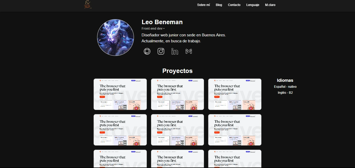
In tldraw, I created an initial sketch of my portfolio. This exercise was crucial, as it allowed me to visualize the structure and flow of my site before starting to code. Here I show you the result:
This sketch became my guide, providing me with a clear direction for when I finally sat down to code. It represented not only the structure of my future portfolio, but also the culmination of all the research and learning I had done up to that point.
With this plan in hand, I felt ready to face the next challenge: turning this sketch into a real and functional portfolio.
Hands to Work: Setting Up the Project
With my design plan ready, it was time to take action. I decided to use Vite as my build tool due to its speed and ease of use. So I opened my terminal and started with the following steps:
- I started the project with Vite: I opted for a configuration without frameworks, using vanilla JavaScript to have full control over my code.
npm create vite@latest- Then, I changed to the project folder:
cd portfolio- Install the dependencies: I chose to use pnpm for its efficiency in package management.
pnpm install- I opened the project in my code editor:
code .- Start the project:
npm run devOnce inside the editor, I proceeded to clean the project of the unnecessary files and code that Vite generates by default:
-
I deleted files like counter.js, javascript.svg, and vite.svg.
-
In main.js, I kept only the import of the styles file.
-
I simplified the style file, removing most of the default rules and changed the background color.
-
I adjusted the index.html, changing the title, removing references to files that no longer existed, and adding the typical structure of
header,main, andfooter. -
I placed folders named
stylesandimgsinside the folderpublic. This cleanup allowed me to start from a cleaner and more personalized base, without distractions or unnecessary code.
This moment marked the true beginning of the development phase. With my research, my sketch, and now my project initialized and clean, I was ready to start bringing my vision to life, line of code by line of code.
Building the Structure: The Navigation Bar
The implementation of the portfolio began with the navigation bar. Initially, a small bar at the top was planned, but the concept evolved during development.
After several tests, a larger navigation bar was chosen. This decision was part of a broader change in approach: the design went from being super minimalist to requiring more space to comfortably display all the content.
The process began by creating the navigation bar container and bringing it to life with CSS:
<header class="navbar">
  <nav></nav>
</header>
.navbar {
position: fixed; /* Esto permite que siempre se vea en pantalla */
top: 0; /* Lo ubico para que esté en la parte superior máxima */
left: 0; /* Lo ubico para que esté en la parte izquierda máxima */
width: 100%; /* Le doy un máximo de anchura del viewport para que ocupe toda la pantalla */
background-color: #1a1a1a; /* Color de fondo para tener un contraste con el contenido main */
box-shadow: 0 2px 10px rgba(0, 0, 0, 0.3); /* Pequeño detalle para más contraste dándole una sombra en la parte inferior */
z-index: 1000; /* Para que se muestre por encima de todo, ya que el fixed hará que pase por muchas secciones y artículos */
}Adding the elements of the navigation bar:
<header class="navbar">
  <nav>
    <ul class="navbar-menu">
      <li class="navbar-item"><a href="#">Sobre mí</a></li>
      <!-- Agregamos la clase 'navbar-item' para manipular los elementos -->
      <li class="navbar-item"><a href="#">Blog</a></li>
      <li class="navbar-item"><a href="#contacto">Contacto</a></li>
      <li class="navbar-item"><a href="#">Lenguaje</a></li>
      <li class="navbar-item"><a href="#">M.claro</a></li>
    </ul>
  </nav>
</header>
.navbar-menu {
display: flex; /* Layout unidimensional */
list-style-type: none; /*Le saca la decoración de item*/
}
.navbar-item {
margin-left: 30px; /* Espacio entre elementos*/
}Adding Life to the Navigation Bar with Hover Effects
After having the basic structure of the navigation bar, I focused on improving its visual appearance and interactivity. I started by adjusting the style of the links, choosing a font size of 16px and a weight of 500 so they would be legible and modern. The white color (#fff) seemed suitable to contrast with the dark background.
Then, I thought about how to make the interaction more interesting. I decided to add some subtle effects when the user hovered over the links. It was nothing extravagant, just a smooth color change and a small line that appears under the text.
For the hover effect, I programmed a color transition from the original white to a slightly lighter shade (#f0f0f0). Then, using the ::after pseudo-element, I created a 2px line that gradually reveals itself under each link when hovering the cursor.
Adjusting the timing of the animations took some trial and error. I wanted them to be noticeable but not distracting. In the end, I opted for a duration of 0.2 seconds for both the color change and the line appearance. (we will talk about the duration later)
The result was a more dynamic and attractive navigation bar. These small changes, although subtle, significantly improved the user experience without complicating the design too much.
<header class="navbar">
  <nav>
    <ul class="navbar-menu">
      <li class="navbar-item"><a href="#" class="navbar-link">Sobre mí</a></li>
      <!-- Agregamos la clase 'navbar-link' para manipular el hover y darle pequeños detalles -->
      <li class="navbar-item"><a href="#" class="navbar-link">Blog</a></li>
      <li class="navbar-item"><a href="#contacto" class="navbar-link">Contacto</a></li>
      <li class="navbar-item"><a href="#" class="navbar-link">Lenguaje</a></li>
      <li class="navbar-item"><a href="#" class="navbar-link">>M.claro</a></li>
    </ul>
  </nav>
</header>
/* Estilos para los enlaces de la barra de navegación */
.navbar-link {
color: #fff; /* Color del texto: blanco */
font-weight: 500; /* Grosor de la fuente: semi-negrita */
padding: 10px 0; /* Relleno vertical de 10px, sin relleno horizontal */
position: relative; /* Posicionamiento relativo para el pseudo-elemento ::after */
transition: color 0.2s ease; /* Transición suave del color al hacer hover */
}
/* Estilos para el texto del enlace al hacer hover o cuando está activo */
.navbar-link:hover,
.navbar-link.active {
color: #e7e3e3; /* Cambia ligeramente el color del texto a un gris claro */
}
/* Pseudo-elemento para crear la línea de subrayado */
.navbar-link::after {
content: ''; /* Contenido vacío necesario para que se muestre el pseudo-elemento */
position: absolute; /* Posicionamiento absoluto respecto al elemento padre */
bottom: 0; /* Alineado en la parte inferior del enlace */
left: 0; /* Alineado a la izquierda del enlace */
width: 100%; /* Ancho completo del enlace */
height: 2px; /* Altura de la línea de subrayado */
background-color: #fff; /* Color de la línea: blanco */
transition: transform 0.2s ease; /* Transición suave para la animación de regreso */
transform: scaleX(0); /* Inicialmente, la línea tiene escala 0 en el eje X (invisible) */
}
/* Estilos para la línea de subrayado al hacer hover o cuando el enlace está activo */
.navbar-link:hover::after,
.navbar-link.active::after {
transform: scaleX(1); /* Escala el tamaño completo de la línea */
transition: transform 0.2s ease; /* Transición suave al aparecer la línea */
}Language Selector
After having refined the aesthetics and basic interactivity of our navigation bar, it was time to tackle some key functionalities that were still missing. Among them, the language switch and the dark/light mode selector. I decided to start with the language selector, since linguistic accessibility is crucial for a professional website. In web development, every detail matters and contributes to the overall user experience.
My vision was to create an intuitive and easy-to-use language selector. I wanted it to be discreet when it was not needed, but easily accessible when the user required it. So I opted for a design that would reveal itself when hovering the mouse over it.
I started with HTML, creating a basic but functional structure for the language selector. My goal was to establish a solid foundation that could easily handle the styles and interactivity I would add later. While coding, I focused on the user experience, making sure that switching between languages was intuitive and accessible.
<div class="language-selector">
  <div class="language-item" data-lang="en">English</div>
  <div class="language-item" data-lang="es">Español</div>
  <div class="language-item" data-lang="fr">Français</div>
  <div class="language-item" data-lang="de">Deutsch</div>
</div>
Each HTML element had a specific purpose. The data-lang attribute was a conscious decision to facilitate the future implementation of language switching.
With the HTML structure established, the next step was to apply CSS styles to the language selector. The goal was to create a functional component that would integrate properly with the existing navigation bar.
I started by defining the style for the main container of the language selector:
.language-selector {
  position: relative; /*Relativo a su contenedor*/
}
This established the basis for the positioning of the dropdown menu. Next, I focused on the style of the dropdown menu:
.language-dropdown {
  display: none;
  position: absolute;
  top: 100%;
  left: 0;
  background-color: #1a1a1a;
  padding: 0;
  border-radius: 4px;
  box-shadow: 0 2px 10px rgba(0, 0, 0, 0.3);
  min-width: 120px;
}
I set up the menu to be hidden by default and to be positioned correctly below the selector. I added a dark background, rounded borders, and a shadow to improve visibility.
To show the menu when hovering over the selector, I used:
.language-selector:hover .language-dropdown {
  display: block;
}
Then, I applied styles to the individual elements of the menu:
.language-dropdown li a {
  display: block;
  padding: 8px 20px;
  color: #fff;
  text-decoration: none;
  font-size: 14px;
  transition: background-color 0.2s ease;
}

.navbar-item.language-selector .language-dropdown li {
  list-style-type: none;
}

.navbar-item.language-selector .language-dropdown li a {
  text-decoration: none;
  display: block;
  padding: 5px 10px;
}

.language-dropdown li a:hover {
  background-color: #333;
}
With these styles in place, I tested the language selector in the browser. When hovering over the element, the dropdown menu appeared smoothly, displaying the language options clearly. Each option responded to the cursor movement, subtly changing color to indicate that it could be selected.
I observed how the component integrated with the rest of the navigation bar. The contrast between the dark background of the menu and the light text made reading easier, while the rounded edges and subtle shadow gave it a touch of depth, making it stand out without clashing with the overall design.
Translation
With the language selector styles in place, it was time to tackle the multilingual functionality of my blog. I decided to use JSON files to store the translations, which would allow me a more efficient and scalable management of the different languages.
I created a new folder called “translations” in the structure of my project. Inside this, I added JSON files for each language I wanted to support: fr.json for French, de.json for German, es.json for Spanish, and en.json for English.
Each JSON file contained key-value pairs for the different text elements on my site. For example, the de.json file for German looked like this:
{
  "about": "About me",
  "blog": "Blog",
  "contact": "Contact",
  "language_name": "English"
}
With the translation JSON files ready and the language selector structure in place, the next step was to prepare the HTML for multilingual functionality. This stage required attention to detail, as each translatable element would need a specific identification.
I reviewed the HTML code of my site, starting with the navigation bar. I added the data-lang attribute to the elements I wanted to translate. This attribute would serve as a link between the HTML and the JSON translation files, allowing the JavaScript script to locate and change the content according to the selected language.
I worked on each element of the header, which contained the main navigation bar. Each navigation link received its data-lang attribute, corresponding to the keys in my JSON files. For example, the link “About Me” ended up like this:
<li class="navbar-item"><a href="#" class="navbar-link" data-lang="about">Sobre mí</a></li>I did the same for ‘Blog’ and ‘Contact,’ making sure that each one had its data-lang attribute.
Finally, I included an element for the light/dark mode switch, also prepared for multilingual functionality:
<li class="navbar-item"><a href="#" class="navbar-link" id="mode-toggle"></a></li>Upon finishing these modifications in the HTML, I had established the foundation for the internationalization of my blog. Each element was ready to receive its corresponding translation, pending the implementation of the JavaScript.
This preparation stage was important. The correct HTML structure would be key for the functioning of the multilingual functionality. Each data-lang attribute would connect the visible content with the translations from the JSON files.
With the HTML ready, the next step was to implement the JavaScript to activate the language selector and make my blog multilingual.
Functionality
The sunset was setting as I started the JavaScript file that would give life to our language selector. This script would be the invisible bridge between cultures, allowing visitors to navigate our content in their native language with just one click.
language.js:
document.addEventListener('DOMContentLoaded', () => {
  let currentLanguage = 'es'; // Default language
  const languageSelector = document.querySelector('.language-selector');
  const languageDropdown = document.querySelector('.language-dropdown');
  const languageDisplay = languageSelector.querySelector('.navbar-link');

  languageSelector.addEventListener('click', (e) => {
    e.preventDefault();
    languageDropdown.classList.toggle('show');
  });

  languageDropdown.addEventListener('click', (e) => {
    if (e.target.tagName === 'A') {
      e.preventDefault();
      const lang = e.target.getAttribute('data-lang');
      changeLanguage(lang);
      languageDropdown.classList.remove('show');
    }
  });

  // Close dropdown when clicking outside
  document.addEventListener('click', (e) => {
    if (!languageSelector.contains(e.target)) {
      languageDropdown.classList.remove('show');
    }
  });

  function changeLanguage(lang) {
    if (lang !== currentLanguage) {
      console.log('Cambiando idioma a:', lang);
      loadTranslations(lang);
      currentLanguage = lang;
    }
  }

  function loadTranslations(lang) {
    console.log(`Attempting to load: translations/${lang}.json`);
    fetch(`/src/translations/${lang}.json`)
      .then((response) => response.json())
      .then((data) => {
        console.log('Translations loaded:', data);
        applyTranslations(data);
        updateLanguageDisplay(data);
      })
      .catch((error) => {
        console.error('Error loading translations:', error);
        console.error('Error details:', error.message);
      });
  }

  function applyTranslations(translations) {
    document.querySelectorAll('[data-lang]').forEach((element) => {
      const key = element.getAttribute('data-lang');
      if (translations[key]) {
        element.textContent = translations[key];
      }
    });
  }

  function updateLanguageDisplay(translations) {
    languageDisplay.textContent = translations['language_name'] || currentLanguage.toUpperCase();
  }

  // Load initial translations
  loadTranslations(currentLanguage);
});
The code starts with an event listener for ‘DOMContentLoaded’, ensuring that the script runs only when the DOM is fully loaded.
These first lines were like the foundations of a house; solid and fundamental. They set the stage for everything that would come after. The ‘es’ for Spanish, defining the default starting point when initializing the page.
Important variables are declared:
document.addEventListener('DOMContentLoaded', () => {
    let currentLanguage = 'es'; // El español, nuestra lengua de partida
    const languageSelector = document.querySelector('.language-selector');
    const languageDropdown = document.querySelector('.language-dropdown');
    const languageDisplay = languageSelector.querySelector('.navbar-link');
currentLanguage: Initialized with ‘es’ as the default language. languageSelector: Selects the language selector element. languageDropdown: Selects the language dropdown menu. languageDisplay: Selects the element that displays the current language.
An event listener is added to the languageSelector:
It prevents the default behavior of the link. It toggles the ‘show’ class on the dropdown menu, showing or hiding it. An event listener is added to the languageDropdown:
Check if the clicked element is a link (‘A’). If so, prevent the default behavior. Get the selected language from the ‘data-lang’ attribute. Call the changeLanguage function with the selected language. Hide the dropdown menu. An event listener is added to the document to close the dropdown menu when clicking outside of it:
Check if the click was outside the languageSelector. If so, remove the ‘show’ class from the dropdown menu. The changeLanguage function:
Check if the selected language is different from the current one. If it is different, log the change in the console. Call loadTranslations with the new language. Update currentLanguage.
Dark/light mode
The implementation of dark/light mode on my website turned out to be a much more complex challenge than I initially anticipated. This development journey not only improved the functionality of my site but also significantly expanded my understanding of theme customization in modern web design.
At first, my approach was quite simple. I thought about using the CSS color-scheme property, believing it would be enough to achieve an effective switch between dark and light modes. However, I quickly realized that this solution was too limited for what I really wanted to achieve. It did not offer the level of control and customization I was looking for on my site.
It was then when I had an epiphany: to create a truly flexible and changeable theme system, I needed to go beyond the default solutions. I needed an approach that would allow me to customize every aspect of the design, both for dark mode and light mode.
With this new perspective, I began working on a more robust and customizable solution. The heart of this new system was based on the definition of custom CSS variables in the :root element. For the default dark mode, I defined a set of variables that controlled various aspects of the design:
:root {
  --background-color: #111;
  --text-color: rgba(255, 255, 255, 0.87);
  --link-color: #646cff;
  --link-hover-color: #535bf2;
  --navbar-background: #1a1a1a;
  --navbar-active: #fff;
  --navbar-hover: #d1d1d1;
  --navbar-language-selector: #1a1a1a;
}
Each variable represented a specific aspect of the design: the background color, the text color, the link colors (both in normal state and when hovering), and various elements of the navigation bar.
For the light mode, I created a similar set of variables, but this time I grouped them under a specific class light-mode:
body.light-mode {
  --background-color: #f1f1f1;
  --text-color: #213547;
  --link-color: #00ff22;
  --link-hover-color: #535bf2;
  --navbar-background: #ebe8e8;
  --navbar-active: #000;
  --navbar-hover: #000;
  --navbar-language-selector: #d4d4d4;
}
This approach gave me unprecedented flexibility to precisely control the appearance of each element in both dark and light modes. The system allowed me to easily customize colors, maintain visual consistency, quickly experiment with color schemes, and implement dynamic theme changes with JavaScript, all by using CSS variables and simply adding or removing a class on the body element.
The implementation of this system was not without challenges. I had to carefully review each component of my site to ensure that it correctly used the new CSS variables. I also had to consider how to handle various aspects of design and functionality to ensure a consistent and pleasant user experience in both modes. Despite these challenges, the final result was a robust and flexible theme system that significantly improved the usability of my website.
After much work and experimentation, I finally implemented all the necessary changes in my CSS to create a flexible theme system. These were all the changes I made:
body {
  color: var(--text-color);
  background-color: var(--background-color);
  transition:
    background-color 0.2s ease,
    color 0.2s ease;
}

a {
  color: var(--link-color);
  transition: color 0.2s ease;
}

a:hover {
  color: var(--link-hover-color);
}

.navbar {
  background-color: var(--navbar-background);
  transition: background-color 0.2s ease;
}

.navbar-link {
  color: var(--text-color);
  transition: color 0.1s ease;
}

.navbar-link:hover,
.navbar-link.active {
  color: var(--navbar-hover);
}

.navbar-link::after {
  background-color: var(--navbar-active);
  transition: background-color 0.2s ease;
}

.language-dropdown {
  background-color: var(--navbar-language-selector);
}

.language-dropdown li a {
  color: var(--navbar-active);
  transition: background-color 0.2s ease;
}
Seeing all these changes together, I realized how much I had accomplished. Each line of code represented a carefully considered decision to improve the user experience and design flexibility.
The smooth transition between light and dark modes, controlled by the transition properties on the body and links, ensured that the theme change was not abrupt or annoying for users. The navbar, with its interactive links and language selector, now adapted perfectly to both modes, maintaining visual consistency and usability.
One of the most satisfying aspects was seeing how CSS variables enormously simplified the process of managing colors. By simply changing the value of a variable, I could adjust the color of multiple elements throughout the site, which made modifications and maintenance much more efficient.
However, the process was not without challenges. I had to make sure that each color combination provided enough contrast to maintain readability, especially in elements like links and text on colored backgrounds. Additionally, I had to carefully consider how certain elements, such as images or icons, would look in both modes.
Despite these challenges, the final result was extremely rewarding. I now had a website that was not only visually appealing but also accessible and easy to use in different lighting conditions. The theme system I had created was robust and flexible, allowing me to make quick adjustments and experiment with different color schemes without having to rewrite large amounts of CSS.
Looking toward the future, I was excited by the idea of continuing to refine and expand this system. Maybe I could add more themes or even allow users to customize their own color schemes. The possibilities seemed endless, and I was eager to explore them all.
However, something crucial still remained to explain in order to complete my theme switching system: the implementation of the logic in JavaScript to make the entire mechanism functional. For this, I created a file called theme-switcher.js, which I imported into my main.js along with other important styles:
import './style.css';
import './public/styles/navbar/navbar.css';
import './public/styles/navbar/navbar-link.css';
import './public/styles/navbar/language-selector.css';
import './src/theme-switcher.js';
The heart of the functionality resided in the code of theme-switcher.js. I started by making sure that the code would only run when the DOM was fully loaded:
document.addEventListener('DOMContentLoaded', () => {
  // ... resto del código
});
Within this event, I selected the key elements: the mode switch button and the document body:
const modeToggle = document.getElementById('mode-toggle');
const body = document.body;
Then, I defined a setMode function that was responsible for switching between light and dark modes:
function setMode(mode) {
  if (mode === 'light') {
    body.classList.add('light-mode');
    modeToggle.textContent = 'M.Oscuro';
  } else {
    body.classList.remove('light-mode');
    modeToggle.textContent = 'M.Claro';
  }
  localStorage.setItem('preferredMode', mode);
}
This function not only changed the classes and the button text, but it also saved the user’s preference in localStorage for future visits.
To make sure that the user’s preference was maintained between sessions, I added code that checked if a saved preference existed:
const savedMode = localStorage.getItem('preferredMode');
if (savedMode) {
  setMode(savedMode);
} else {
  setMode('dark');
}
If there was no saved preference, it would set dark mode as the default.
Finally, I added an event listener to the mode change button:
modeToggle.addEventListener('click', (e) => {
  e.preventDefault();
  const newMode = body.classList.contains('light-mode') ? 'dark' : 'light';
  setMode(newMode);
});
This code detected clicks on the button and switched to the opposite mode of the current one.
This entire mechanism worked thanks to a simple but crucial element in my HTML:
<li class="navbar-item"><a href="#" class="navbar-link" id="mode-toggle">M.Claro</a></li>With this JavaScript code, I managed to bring my theme switching system to life, creating a dynamic and customizable user experience. Each click on the “Switch mode” button triggered a series of changes that transformed the appearance of my website, adapting to the user’s preferences and remembering them for future visits.